
I thought it would be an interesting experiment to see how Hubspot’s homepage has changed over the last 12 months.
After all, this is a hugely successful SaaS company – and has been for a long time. So how much better can they get?
So, I fired up the wayback machine, and here’s what I found…
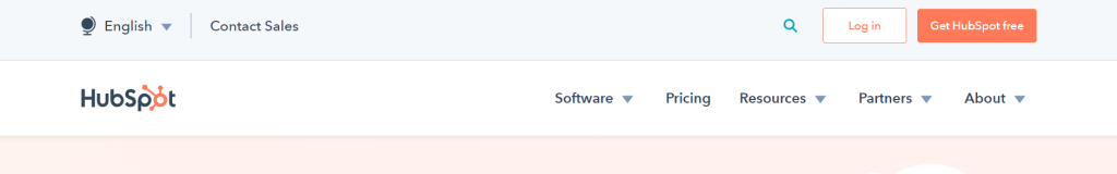
#1: They’ve simplified their menu
It’s gone from:
to
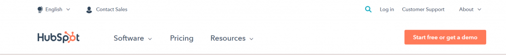
To my eyes, it looks a lot sleeker.
#2: They changed their call to action
As you can see above, they’ve gone from “Get Hubspot free” to “Start free or get a demo.”
The new text has a couple of interesting wrinkles. First, it implies that you get to choose whether or not to schedule a demo. Good news if you hate being railroaded into a sales pitch…err, I mean a “demo.”
Also, great news if you like demos.
Second, the verb “start” feels more active than “get.” Now, marketers tend to love the word “get” as it implies you don’t have to do much work. You just “get” the result you want.
“Start” implies a process that’ll happen over time.
Also, “start for free” could give the impression that this is a limited-time trial – which isn’t really the case for Hubspot.
So, from a “marketing logic” perspective, the wording is counter-intuitive. But, if they’ve tested it and it works, then that trumps any theory.
(Personally, I like it.)
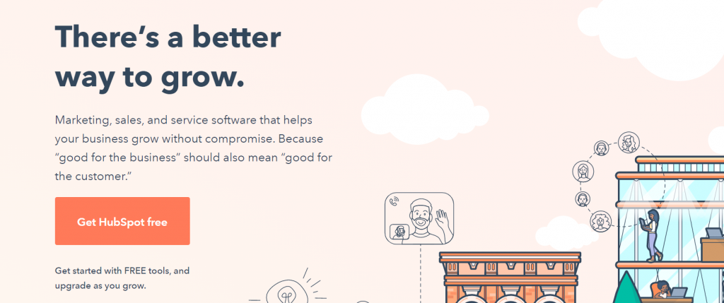
#3: They replaced their “below button” text
Moving down the page, the next change we see is below the next call to action button.
It was:
but they’ve changed:
“Get started with FREE tools, and upgrade as you grow.”
to
“Get started with free tools, or get more with our premium software.”
So they’ve removed the capitalisation of “FREE” and changed the second half of the sentence so upgrading is something to do sooner, rather than later.
Interestingly, this new wording existed on the old version of the page. It was below the final call to action button at the bottom of the page. So last year’s “Get started with FREE tools, and upgrade as you grow” might have been part of a losing test.
#3: They’re highlighting their CRM
Scrolling further down the page, we see a change in focus in their offer.
On the old version, they presented 5 different options in a grid, giving them almost equal billing:
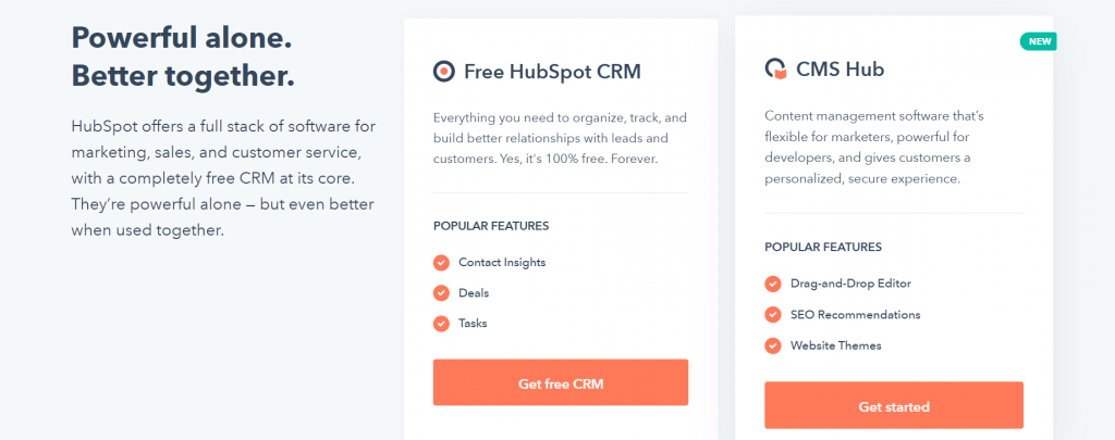
In the new version, they pulled out the CRM – their core offer – and placed it front and centre:
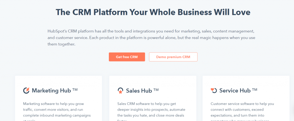
I’m not wildly enthusiastic about “Your Whole Business Will Love.” It feels cliched. But I like it a lot more than “Powerful alone. Better together.”
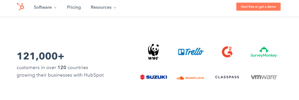
#4: They’ve updated their credibility elements
Finally, Hubspot has updated a number of credibility elements. For example, the number of users has been updated from 78,700 to 121,000+. And they’ve added WWF, Trello, and Suzuki to their list of users:
Summary
The point of this is blogpost is to show that successful companies split-test their web pages. Not only that, but they test pyschology and usability, rather than random elements.
Hubspot tested a menu, CTA text, wording next to the button, and the layout of their offers… not some paragraph halfway down the page.
So, if you’re not testing enough (and who is?), test more. And test the things that are likely to matter.
All the best,
Steve